The Yellow Path: How Tactile Tiles Make Public Transit Accessible
The Language Beneath Your Feet
Next time you walk through a metro station, look down. Chances are, you’ll spot rows of bright yellow tiles lining the platform edge — and chances are, you’ve walked right over them without a second thought. They’re easy to miss when you’re rushing for a train, eyes fixed on your phone or the departure board overhead.
But for millions of visually impaired commuters around the world, those tiles are everything.
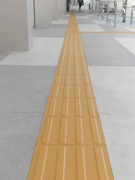
From the London Underground to the Delhi Metro, tactile paving has quietly become one of the most important accessibility features in modern public transport. Small, often overlooked, yet deeply intentional — these tiles are a language written on the ground, a conversation between infrastructure and the human body that most of us never even know is happening.
Why yellow?
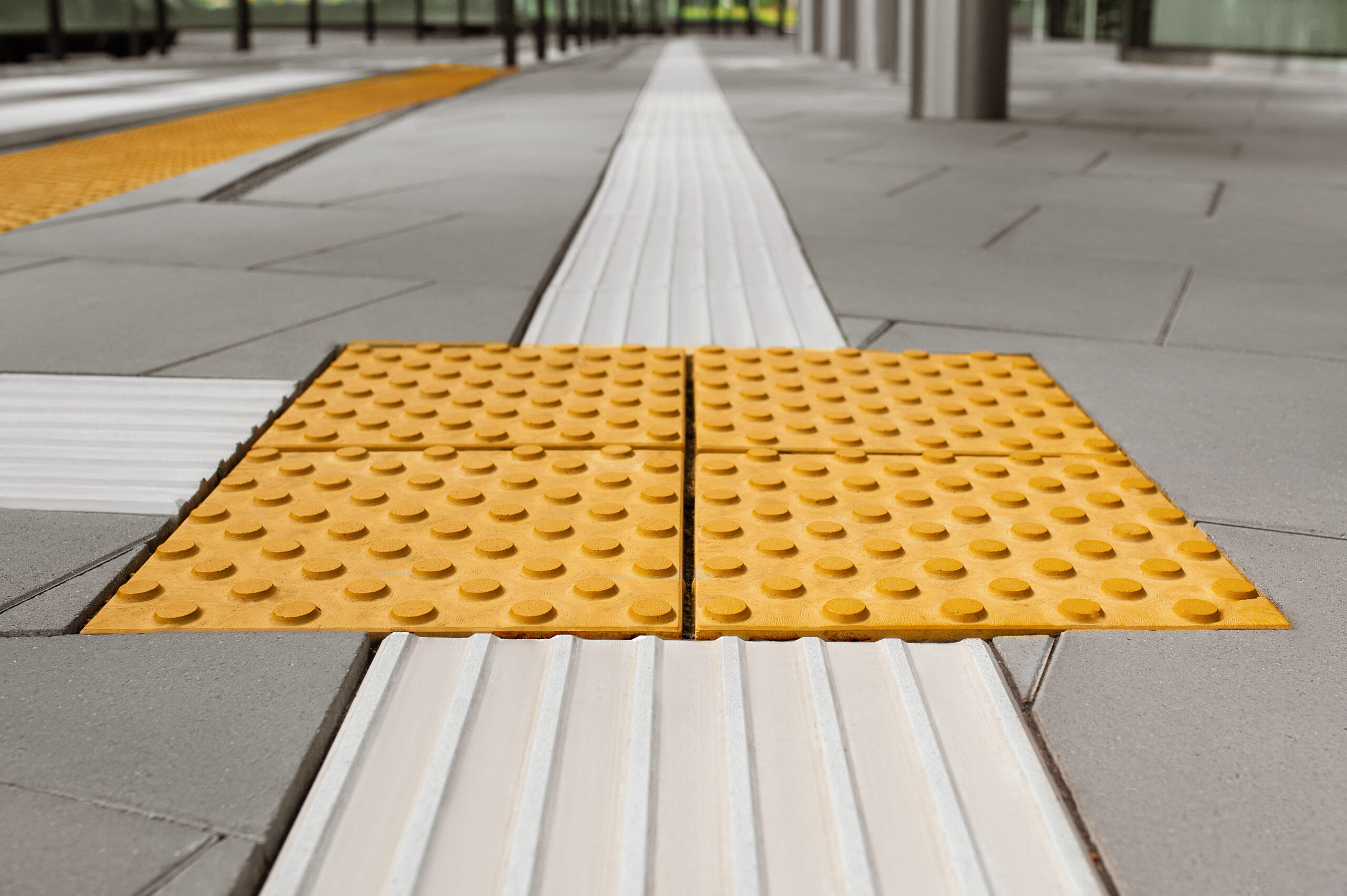
The colour isn’t arbitrary. Yellow offers maximum contrast against the grey concrete and dark flooring typical of most stations, making it visible not just to the completely blind, but also to those with partial vision or low-light sensitivity. In the flickering fluorescence of a busy underground station, that contrast can mean the difference between confidence and confusion. It’s a choice that balances function with visibility — quiet design doing loud work.
What do the patterns mean?
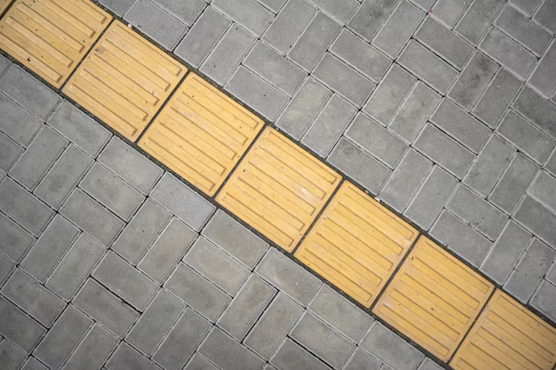
Tactile tiles come in two distinct designs, each carrying a specific message underfoot. Lined or bar-shaped tiles guide a person forward, indicating a safe path of travel. Dotted tiles — sometimes called “blister” tiles — signal caution: a junction, a turn, or a hazard like a platform edge is nearby. Together, they form a silent navigation system that communicates through touch alone, no sight required, no assistance needed. There’s a quiet elegance in that — a world overflowing with visual information, and here is something that simply speaks through the soles of your feet.
More than just tiles
The Delhi Metro, in particular, has made remarkable strides in accessibility, integrating tactile paths, audio announcements, Braille signage, and wheelchair-friendly infrastructure across its network. In a city as dense and overwhelming as Delhi, these features aren’t luxuries — they are lifelines. A reminder that great design isn’t just aesthetic, it’s empathetic.
Accessibility features like tactile paving aren’t add-ons. They reflect a fundamental choice: that public spaces should truly be public — built for everyone, not just the majority. When a city gets this right, it sends a message far beyond the tiles themselves: we thought of you. You belong here too.
The next time you walk past those yellow tiles, maybe pause for a moment. Someone else is depending on them to find their way


